Microsoft Desirability Toolkit Product Reaction Words
Product reaction words
We all want to know if our users are satisfied with our product, right? And by product, we mean any interaction the user has with the interface. But how can you really tell if users are satisfied? If the product is desirable to them? If they mean what they say when they respond to structured survey questions giving you feedback on their experience?
We find out by using Microsoft’s product reaction cards.
We love the reaction cards because they give users control over the story of their experience following a usability test. We find them especially useful when combined with a quantitative feedback mechanism such as The System Usability Scale. In this blog, I'll tell you about the origin of the cards, how they work, and how we use them in our
usability studies.
Microsoft Desirability Toolkit origins
In 2002, two UX researchers at Microsoft, Joey Benedek and Trish Miner, set out to create a feedback mechanism to understand the intangible aspects of a user’s desire for a product. They wanted to know if users found products fun, enjoyable, and desirable enough to purchase.
The original “Desirability Toolkit” had two aspects:
- Faces questionnaire, in which participants were asked to rate how closely their experience related to each of 6 different faces using a 7-point Likert scale to indicate their response
- Card selection exercise, in which participants were asked to choose descriptive words or phrases from a large set of product reaction cards.
Faces questionnaire
Here’s an example of a question using a face.
Look at the picture and circle the rating on the scale that most closely reflects how performing the tasks today made you feel.

| Not at all like this | Very much like this | |||||
|---|---|---|---|---|---|---|
| 1 | 2 | 3 | 4 | 5 | 6 | 7 |
The faces questionnaire proved problematic for some users, who had difficulty understanding the emotion portrayed in the face and explaining the reason for their rating. So, it was dropped from the toolkit.
Product reaction words list
The second part of the desirability toolkit - the product reaction cards - consisted of a large set of cards that participants used to select words that matched their experience.
We all know that if we ask users how they feel about a product’s desirability, they’re likely to inflate their responses to be more positive than what we observed as they engaged with the product. The reason they say nicer things than what we observed is because they want to be nice; they want to please us. It’s human nature. Microsoft kept this tendency toward a positive response in their creation of the cards, with 60% being positive words and 40% being negative words.
The Product Reaction Words list started out with 75 words but developed over several studies into the following final list of 118 words.
Using the product reaction cards in usability tests
Here’s how we use the cards in our usability tests.
For in-person studies, we have made laminated cards for each of the 118 words. We laminate them so that we can reuse them, but it’s not a requirement. You can make a new set for every study, if needed.
We spread the cards along a table so that the cards are touching but not overlapping. When the user completes the last task, we direct them to the table and provide the following instructions:
“As you can see, this table is covered in cards that have words on them representing strongly positive, strongly negative, and neutral words. There are 118 of them altogether, but they are in no particular order. What I want you to do now is walk down the table, picking up any words in any combination of positive, negative, or neutral, that reflect your experience of working with the product/interface today. There’s no set number of words to pick, but to give you an idea, pick 5 or 6 words. If you pick more, which is fine, you can tell us what your top 5 words are. When you’re finished picking your words, bring them back to me, then tell me each word you picked and what it means to you.”
After each session, we move the cards around to place them in a different order.
For remote studies, our ux research agency uses collaborative software like Zoom or Teams. When the participant finishes the last task, we show them a Word table or Excel file of the Microsoft reaction words. We then ask them to read over the rows and columns of words and select the 5 or 6 words that fit their experience. If they are comfortable using the highlighting tool in Word or Excel to make their selections, they can do this as they go along to make placeholders so that they can go back and discuss the words they picked. Or, if they want us to manage the process, we can take over mouse control and highlight the words they tell us.
The list of reaction words is alphabetical, but if you want to mix up the words on the screen so that participants see them differently each time, you can sort them differently for each session.
Customizing the reaction words
You can also customize the list of reaction words, creating your own card deck or adding some specific words to the full deck to reflect the goals of your study. We have done this before and then pointed out how many participants chose any of the new words on the list.
Some people go with a smaller set of words. Microsoft began with a list of 55. So, you can make the list smaller, if you like.
We use the whole set and we always observe that users catch on to the task quickly and really enjoy it. In just a few minutes, they have reviewed all the cards/words, they have made their selection, and they are ready to share the story of their experience with us.
But the most amazing thing is how frequently participants pick the very same word out of a deck of 118! In addition to the number of words that are the same, we also see tremendous thematic overlap in similar words chosen by participants.
Showing the product reaction word results
We typically present the reaction card results in a word cloud, which quickly shows the words chosen most often. Here's an example from a study of 23 participants.
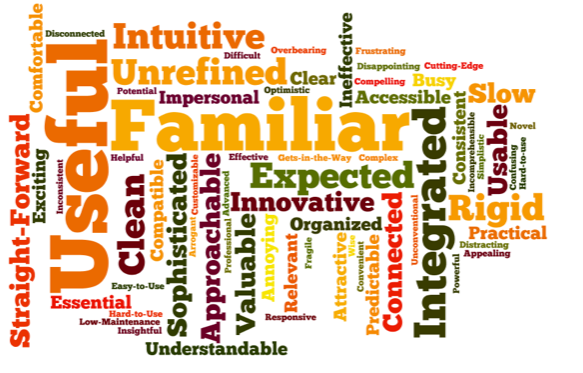
In addition to showing the results in a word cloud, we often include a table of the positive and negative words chosen with a count of how many times each word was selected by each user. For example, the table below shows a partial list of the words presented in the word cloud, indicating the number of times it was selected and whether it was deemed a positive or negative word.graph
Reaction cards are great in small studies
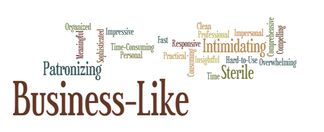
You don’t need big study numbers to get great results from using the product reaction cards. Here are the cards from a single study with six participants in a day.
The same powerful consistency is clear in the results.
Reaction cards are great in iterative studies
We can also use the reaction words to establish a baseline for user satisfaction in the first study, which can then be used in iterative studies to track improvements in user satisfaction as the product goes through development or redesign. The example below is from 3 studies of a web-based application for hotel properties worldwide to implement and monitor green initiatives.
User testing of the client’s first version demonstrated that the general idea of the application was motivating; however, the product had significant problems that slowed or stopped users from achieving success. Participants’ repeated positive card choices were low with only "comprehensive," "professional" and "usable" selected twice each; but the themes of quality, appearance, ease-of-use, and motivation emerged from participants’ card choices.
The second study was of the prototype of the redesigned application. The transformation of the users’ experience was night to day. The positive card choices from 12 users now represented 82% (compared to 42% in the first study) with the most often selected card being "useful."
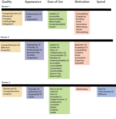
With such a positive and significant measurement of change, the development team focused on the remaining issues, and a small test of the pilot version was conducted with 4 users just before launch. The pilot version results showed that all participants chose only positive words. The theme of speed now predominated and confirmed that the earlier negative issue of slow speed was now a positive feeling of fast speed—the application was fast, time-saving, and efficient.
Using product reaction cards in your UX studies
You can do this. Using the Microsoft reaction cards is easy and the results are powerful. What’s more, Microsoft has given us permission to use them with only the following disclaimer:
“Developed by and © 2002 Microsoft Corporation. All rights reserved.”
You don’t have to do complex diagrams to show the results. You can just count the number of times each word is chosen and present these results.
Or use a free word cloud generator to turn the word counts into a cloud. Then you can do some quick clustering of similar words to present themes emerging from the words users chose.
And, of course, use these results along with your other feedback mechanisms, such as The System Usability Scale, to compare your results from different perspectives. By triangulating your data from different sources, you strengthen your case for understanding what users showed you about their experience.
Want more practical insights? Check out these blogs.

Carol Barnum
Carol brings her academic background and years of teaching and research to her work with clients to deliver the best research approaches that have proven to produce practical solutions. Carol’s many publications (6 books and more than 50 articles) have made a substantial contribution to the body of knowledge in the UX field. The 2nd edition of her award-winning handbook Usability Testing Essentials is now available.

